As the last votes for the 2024 US Presidential Election are counted, it is time to reflect on my model. In this reflection, I will go over my predictions for the electoral college and national popular vote. After comparing them with a simple eye test, the post will shift toward more rigorious error analysis. At the end of the post I will discuss what I think went wrong with the model and what I would change in future iterations of the model.
Prediction vs. Results
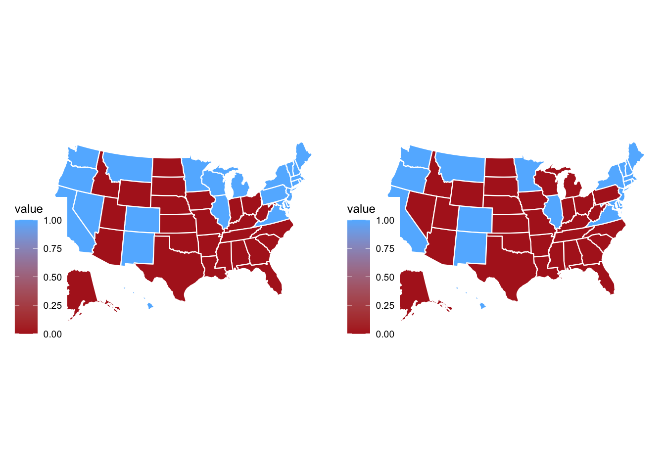
Below are electoral college maps for the 2024 election. The map with my predictions is on the left and the correct map is on the right. My map predicts a Harris victory with 276 electoral votes. However, the correcnt map on the right shows a Trump victory with 312 electoral votes. My model incorrectly predicted the winning candidate in Nevada and the Blue Wall states: Pennsylvania, Michigan, and Wisconsin.

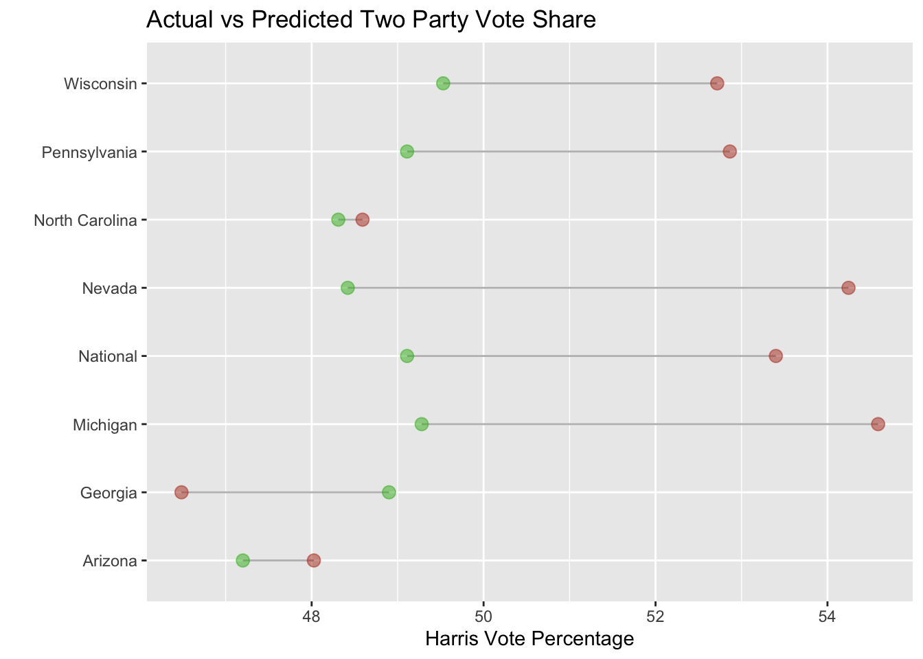
Digging deeper into the data, below is a graph showing my predictions for Harris’ Two-Party vote share in each state and the national vote compared to the actual results. In the graph, the actual result is green and my prediction is brown. The graph shows that my national vote prediction was off by several percentage points.
The graph shows two interesting trends. The first trend is that my prediction was closest in North Carolina and Arizona. In both of these states, I predicted the correct vote share within less of a percentage point. On the surface, the two states have little in common that would easily explain why my model did well in both states. The states are geographically distant, North Carolina has 3 million more people than Arizona and Arizona is much more racially diverse. Another interesting trend is that I overshot the correct vote percentage in all of the predictions except Georgia. What caused this underestimate in Georgia?

Accuracy
The table below quantifies the error of each of the predictions. The table shows MSE which is one measure that can be used to interpret a predictive model. When it comes to MSE, the lower the value the better. Using MSE, Nevada was the biggest miss and North Carolina was the state where I was the closest in my prediction. MSE reveals “bands” of how large each miss was relatively. Michigan and Nevada were large misses, Pennsylvania and Wisconsin were moderate misses, Georgia was a small miss, and North Carolina and Arizona were relatively spot on.
The second column on the table shows bias. Bias is useful for thinking about error of a model because it is in the units of prediction, unlike MSE, and also shows the directionality of the miss (over vs under estimate). In the table, a negative bias means that I overestimated Harris’ support and a positive value means I underestimated.
| Region | Mean Squared Error (MSE) | Bias |
|---|---|---|
| National | 17.96 | -4.24 |
| Arizona | 0.68 | -0.83 |
| Georgia | 5.83 | 2.41 |
| Michigan | 28.19 | -5.31 |
| Nevada | 33.93 | -5.82 |
| North Carolina | 0.08 | -0.28 |
| Pennsylvania | 14.09 | -3.75 |
| Wisconsin | 10.16 | -3.19 |
Why Was the Model Wrong
My views on what went wrong with the model can be boiled down to two points: the data used and the model itself.
The most common explanations that I have seen on why Harris under performed are rooted in the fundamentals. The fundamentals are variables like GDP, incumbency, and approval rating. If this explanation is correct then a fundamentals model should have better accuracy in predicting then a model that includes other factors like demographics, turnout, or poll data. This could explain why my model went awry because I utilized both fundamental and polling data to make a prediction.
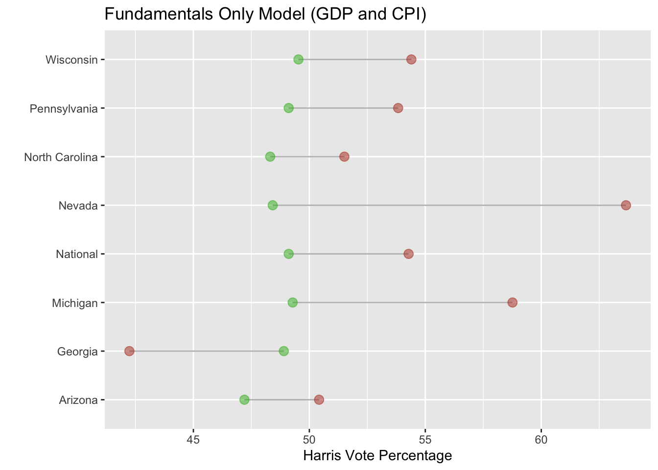
However, this seems to not be the whole story. Below is a graph comparing the fundamental inputs (GDP and CPI) of my model to the actual results. As you can see, the prediction is even worse than my model that includes polling data.

Ultimately, further tests would need to be conducted to see whether fundamentals were a better predictor. Personally, I believe fundamentals that had a personal component were probably better predictors. This would include inflation measures like CPI or measures of personal income like RDPI. One could test this by isolating these variables and making a prediction based on each statistic by itself.
Another way that the data could have been a problem with my model is the inclusion of certain data points. In my final election prediction blog, I also had this concern. For the national vote prediction, I made a prediction using every single data point and another one excluding what I thought were outlier data points like 2020 for economic variables and 2016 and 2020 for polling data. Ultimately, I stuck with the model that included every data point due to better in-sample and out=of-sample fit; however, the model that excluded data points ending up being more accurate.
To test, whether it is better to exclude these data points, the same two models could be used to predict congressional elections since there are many more. If the model without the data I identified as “outliers” performed better, a case for excluding those points could be made. However, I excluded the data based on little mathematical evidence and would rather see a more structured apporach for identifying what data points are outliers. Additionally, I worry that excluding too many data points when there are few elections could create over-fitting.
On to the actual model, one issue that I think effected the accuracy of my model is the weighting between fundamentals and polling. In some states, polling is much more accurate than others. Due to this variance in polling accuracy, the model should have weighted polling data differently for each state. Interestingly, the states that my model predicted closely have historically lower polling error.
What I Would Change Next Time
If I were to create a model for the 2028 US Presidential Election, I would focus more on the fundamental data. I would like to include more data points that align with the concerns of voters. In the model for the 2024 election, I included CPI to reflect voters’ concern about inflation. However, I would have liked to include data on housing since that was big concern amongst voters too.
The other major change I would make is to vary the model by state. Each state has different characteristics that should be taken into account when making a model. Specifically, I would add variables that are more prevalent to voters in the state and weigh them accurately. For example, I would have weighted inflation based upon the severity in each state. In the future, I would also aim to use state level data. As I was making the model, I had difficulty finding state level data such as inflation, GDP, and RDPI. Instead I used national level data which I think impacted correlation and led to the result of most predictions being an overestimate