“Read my lips: no new taxes”
– George H. W. Bush.
Despite making this promise, Bush later reversed course on the statement and raised taxes. This decision by George H.W. Bush at the 1988 Republican National Convention is often cited as one of the reasons why he lost reelection in 1992. Other one-term presidents like Herbert Hoover and Jimmy Carter have seen their reelection chances dwindle based on their economic policy and the overall economic performance in the United States. This week, I will further examine the connection between economic performance and an incumbent’s reelection chance. To achieve this, I will complete extension 1 by creating several predictive models based on key economic indicators.
Gross Domestic Product (GDP)
The first economic indicator that I will examine is GDP. GDP stands for Gross Domestic Product and is the most common measurement for determining an economy’s health. GDP takes into account the market value of all goods and services produced in a country. For this model and the rest of the models, data from the second quarter of the year leading into the incumbent’s reelection will be used. Using data leading into an election instead of throughout the complete time in office aligns with the findings of Christopher Achen and Larry Bartels in Democracy for Realists. In their predictive models using economic indicators, they found that short-term changes in the quarters leading into the election were more predictive then long-term changes.
In the scatter plot below, the second quarter GDP growth is plotted against the incumbent party’s popular vote share. Additonally, the scatterplot is fitted with a line from the regression relationship between the two. Looking at the plot, a moderate positive correlation is evident outside of the 2020 election which appears to be an outlier. The correlation coefficent is .43 with 2020 included and .57 without.
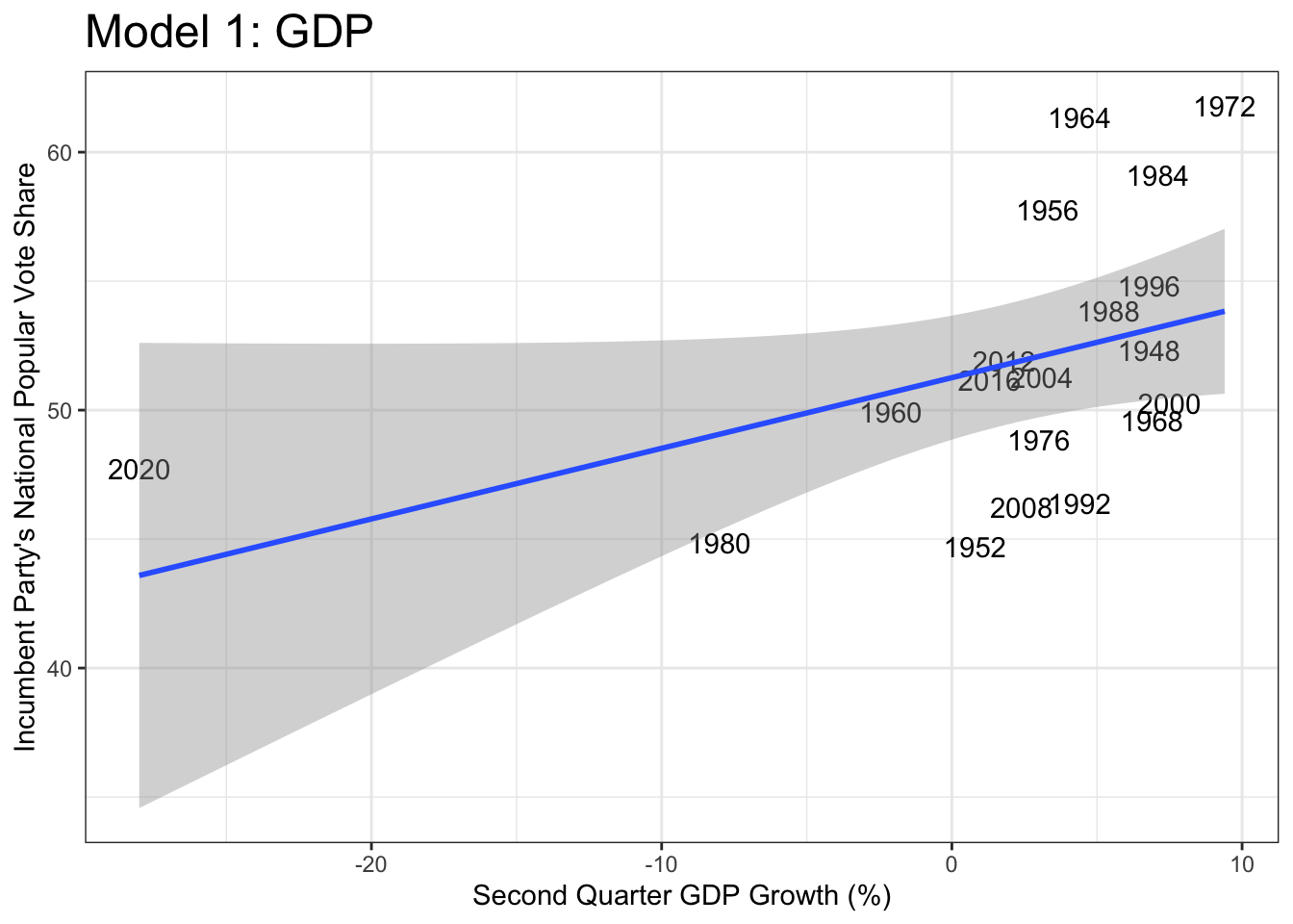
Using the linear regression, which includes the 2020 election, to create a model, we can predict the incumbent vote share for the upcoming 2024 election using the GDP growth in the second quarter of this year. The model predicts that the Democratic party will capture 52.1% of the popular vote. The confidence interval gives a lower bound of 41.6% and an upper bound of 62.5%.
Unemployment
Another key economic indicator is the unemployment rate. Compared to the GDP, it can be argued that the unemployment rate is a better predictor of voter intention because voters are confronted by it daily. Whether a person or the people around them have a job is easier to see then the flucation is GDP. Additionally Barry Burden and Amber Wichowsky analyzed county level data and established that there is a connection between unemployment rates and voter turnout.
In the scatterplot below, it is hard to identify a correlation but the 2020 election is once again an outlier. The correlation coefficent is -0.13 with 2020 included and turns slighly positive without.
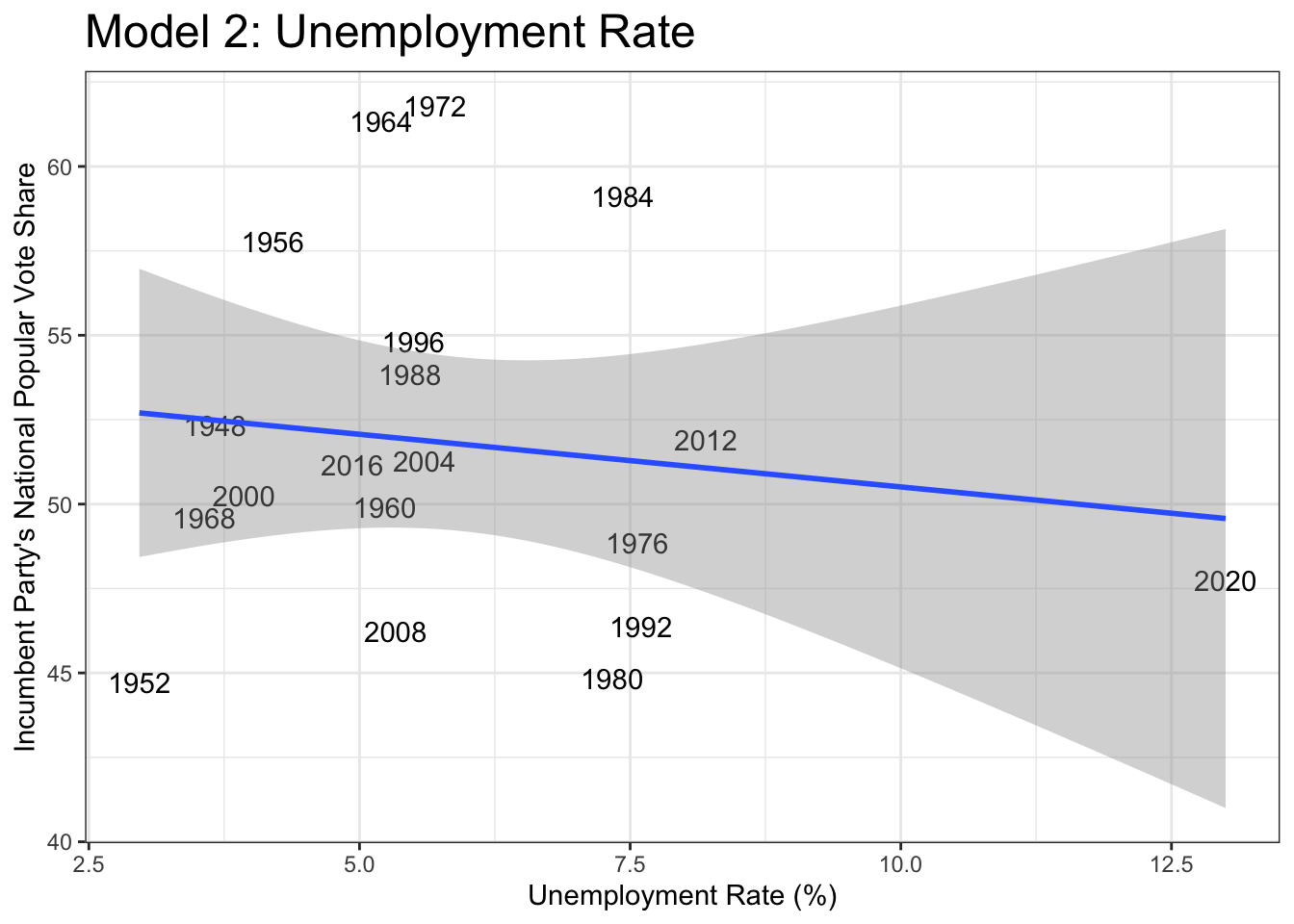
The unemployment model predicts that the Democratic party will capture 52.4% of the popular vote. The confidence interval gives a lower bound of 40.7% and an upper bound of 64.1%.
Current Events (Inflation and Stock Market Performance)
For the third and final model, I picked two economc indicators that have been at the forefront of the presdential news cycle. Inflation has been at the top of voter’s minds since it peaked at around 9% during the pandemic. In a May survey, Gallup reported that 41% of Americans view inflation as the top financial issue. Before the pandemic, 10% was the highest share that inflation received.
Additionally, the stock market has been central in the news cycles due to the impending fear of a recession. Several key recession indicators like the Sahm Rule have recently been triggered, which have caused some to consider shifting their investments to safer options.
For this model I used CPI to represent inflation and S&P 500 “movement” to stand in for the stock market. S&P 500 movement is simply the difference between the market high and market low. This fluctation is used to capture investor’s panic and market volatility.
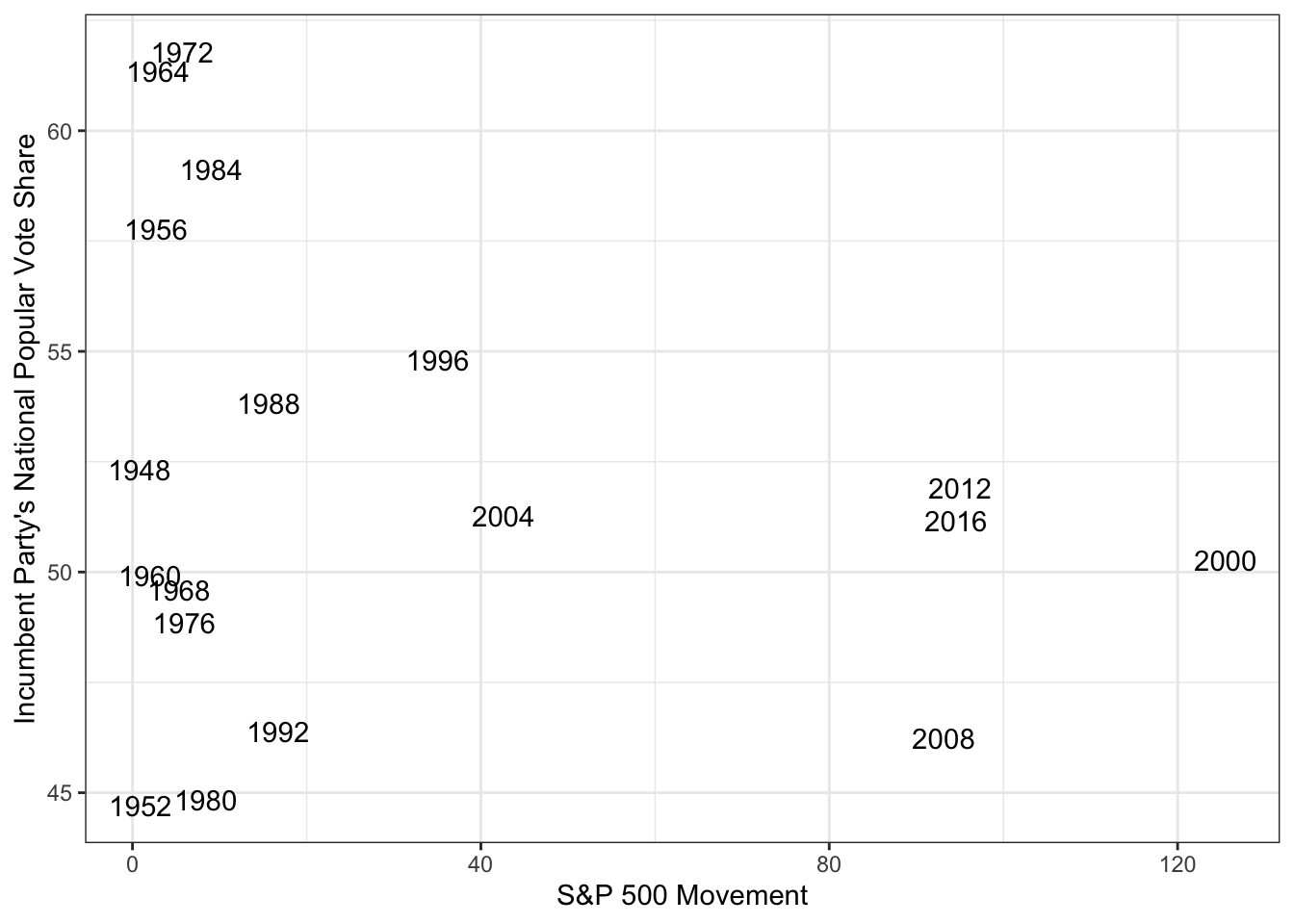
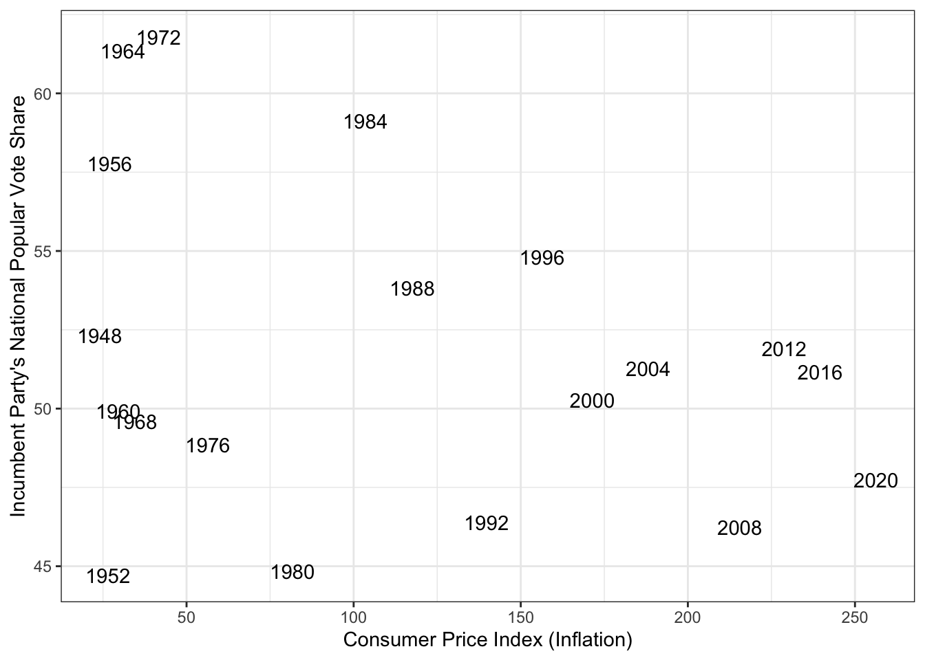
The scatter plots above show the relationship between the two economic indicators and incumbent vote share. Both plots show a negative correlation with vote share. The 2020 election is removed from the S&P 500 movement plot to better show the negative correlation. When using multiple variables to create a model multicollinearity, redundant independent variables, can be a problem. However CPI and S&P500 movement have a correlation coefficient of .73.
Using the current events model, the Democratic party is predicted to capture 48.1% of the popular vote. The interval on the prediction is 34.9% to 61.3%.
Comparing Models and Conclusion
To evaluate the three models, I used both in-sample and out-of-sample methods. This includes R^2, Mean Squared Error (MSE), and cross-validation
| Measure | Model 1: GDP | Model 2: Unemployment | Model 3: Current Events |
|---|---|---|---|
| R^2 | 0.1403326 | -0.03900502 | -0.02978737 |
| MSE | 20.90708 | 25.26856 | 23.57119 |
| Cross-Validation Error | 2.2576 | 2.10268 | 2.398593 |
From a quick glance, it is easy to see that the models are not the best. The GDP model has a low R^2 and the other two are negative. This means that the models do a poor job at explaining the variance in the data. Furthermore it is unclear which model is best when looking at the MSE and Cross validation. The unemployment model has the worst MSE (widest dispersion of errors), yet has the best cross-validation error.
To conclude, the models I have created tell us that economic data is not enough on its own to predict popular vote share. However, the models demonstrate that economic data does not tell one conclusive story as the popular vote share was sensitive to the changes. The difference between the 52% predicted by the first two models and 48% predicted by the last model is enough to change the electoral college outcome.